ART & METHOD
Custom Resolution-independent User Interface Controls
Recently, I became interested the techniques used by designers of iPhone and iPad apps to draw custom interface controls in a resolution-independent way. Oddly, these techniques aren't widely discussed.
A few tips for others seeking this kind of information:
From what I can determine, most of the resolution-independent designs posted to sites like Dribbble are composed of shape layers ( produced using the vector drawing tools in Photoshop ) to which layer effects are then applied to provide texture or special lighting.
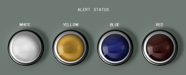
As a test, I attempted to recreate a real-world control interface in a resolution-independent manner. I chose the alert status panel of a Nike Missile battery for this purpose. The image posted below is the result of this effort. Provided the typefaces used in the image are installed, this image may be scaled to any size.
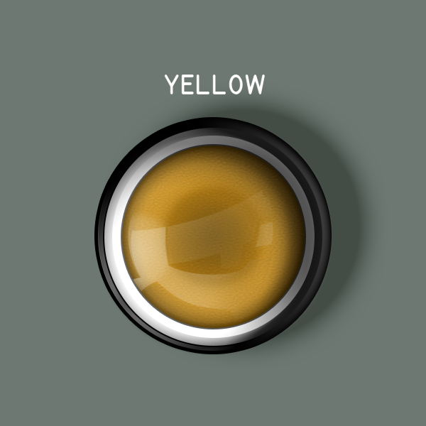
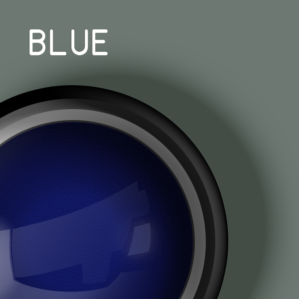
According to MMS Subcourse No. 151, the alert status of a Nike-Hercules missile battery varied between three states: White (equipment testing status), Blue (battery prepared for action), and Red (battery engaged with enemy). Yellow status was no longer used by the time Nike-Hercules and Improved Nike Hercules missile batteries were deployed (~1954).
The typeface employed on the Nike Hercules launch set controls and indicators is similar to MS-33558 — a military standard for numeral and letter markings on aircraft instruments. MS-33558 asserts the use of uppercase Gothic text for marking instruments. Unfortunately, it was established on January 26, 1968 and therefore post-dates the typeface used on a Nike launch set.
Interestingly, a 1992 report produced by NASA titled "On the Typography of Flight-deck Documentation" indicates lowercase text is easier to comprehend than uppercase text in most situations due to pattern recognition of word shape.
Update 2012-07-25: Added notes regarding the launch set alert status.
Update 2012-07-24: Retina-fied the images served in this article with the addition of Troy Mcilvena's jQuery-Retina-Display-Plugin and the extension of a regular expression in the Stacey CMS create_asset_collection method.
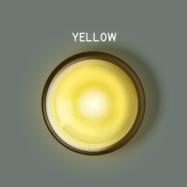
Update 2012-07-23: Updated example Photoshop archive to include lighted representations of the alert status indicators.
The example Photoshop file is offered royalty-free for personal and commercial use without attribution under the terms of the Creative Commons Attribution 3.0 Unported License.